Built the foundations of Auction Mobility’s design system to unify our product experience, reduce UI inconsistencies, and help developers ship faster.
Shared language and a clean structural foundation let designers and engineers collaborate with far less friction.
Strengthened design foundations decreased irregularities across all products and improved overall harmony.
Improved rollout efficiency let sales move faster, fully assured the system could support expanding demand.
Implementing a new Design system allowed us to also introduce a “face lift” for all of our UIs
The Challenge
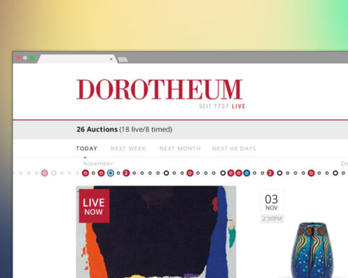
As more clients rolled in, our production pipeline simply couldn’t keep up. Inconsistent UI, repeated manual work, mismatched components, and color systems weren’t accessible or scalable.
Years of rapid growth had created design debt, and without a shared language across teams, even simple global edits became time-consuming. Brand launches slowed down, and the product began to feel increasingly fragmented.
We needed more than a facelift — we needed a future-friendly foundation. A unified, structured system that simplified collaboration, strengthened visual consistency, and made us faster across the entire delivery chain.
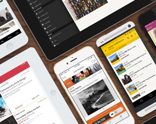
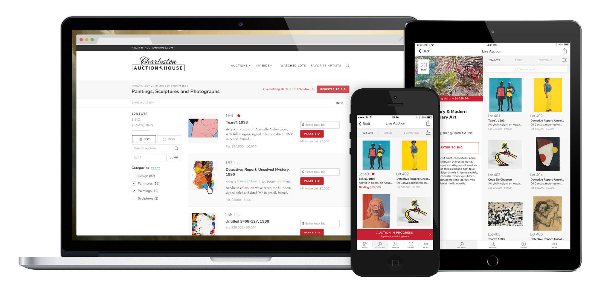
Our new approach had to support accessible color frameworks, reusable components, and clear documentation, all working together to deliver a cohesive experience for every auction house, on every device.
The plan
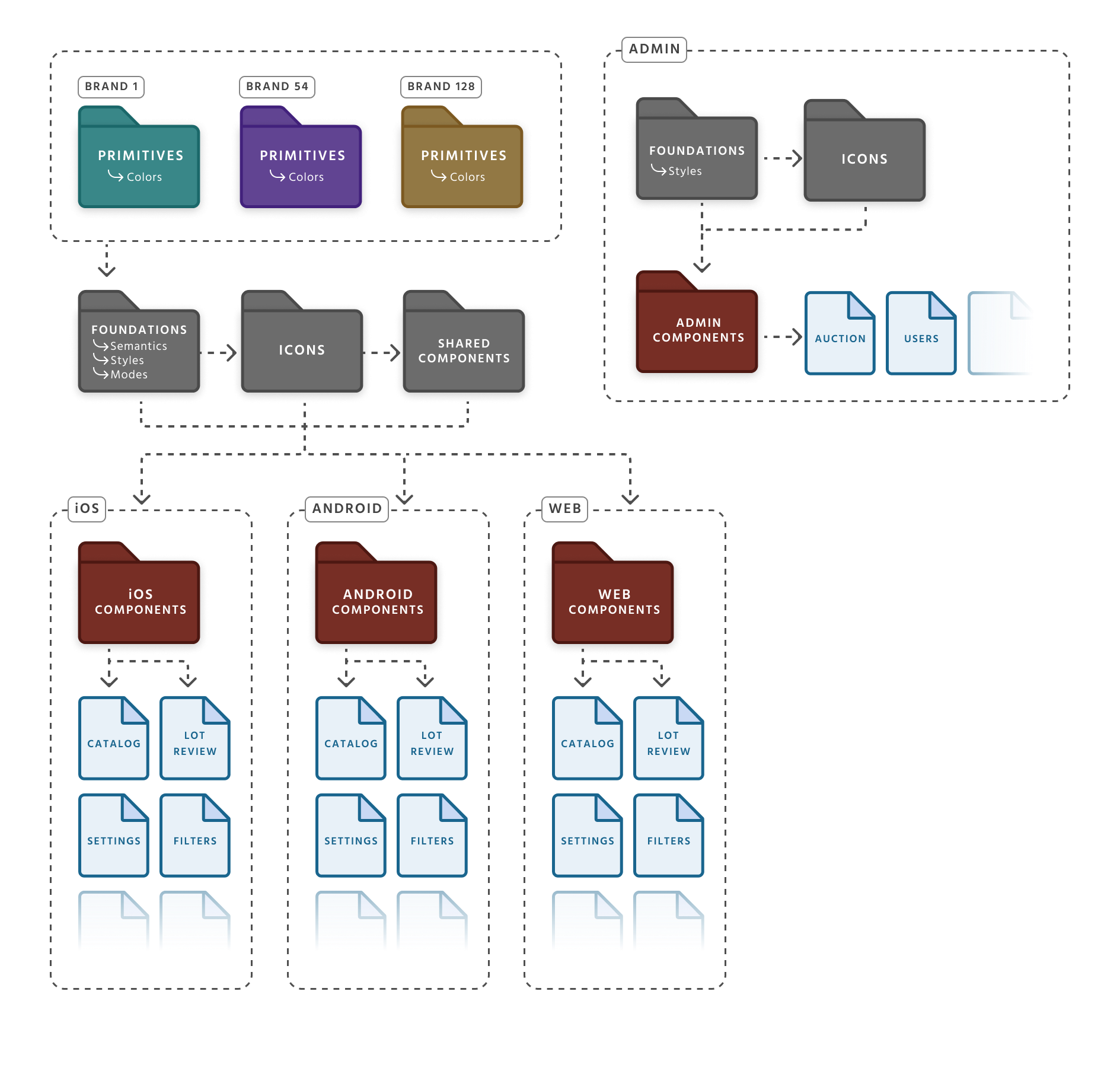
With the team, I led a full cross-platform full mapping of UI components, patterns, and variants. This became the backbone of our shared dictionary, giving designers and engineers a common language and making collaboration dramatically smoother.
- Unified Naming & Shared Language — established consistent names for components, variants, and variables, giving designers and engineers a single, reliable vocabulary across teams and platforms.
- Multi-Brand Architecture — restructured the system to support multiple white-label brands by separating colors into dedicated brand files, making updates cleaner, scalable, and easier to maintain.
- Shared Atom Library — built a shared library for small, reusable components used across web, mobile, and internal tools to help reduce clutter.
- Foundational Design Tokens — built tokens for color, spacing, and typography to support scalable theming.
- Central Documentation — created a comprehensive, accessible source of truth so designers, engineers, and PMs could align effortlessly and adopt the system at scale.
A Future-Friendly Solution
I introduced a new file structure more suited to efficiently support our growing client base by separating shared foundations from brand-specific layers. This modular approach made the system easier to maintain, faster to scale, and smarter to adapt as more brands were added over time.
Flexible Color Management
We rebuilt our color management approach by auditing every UI element and uncovering inconsistencies and accessibility gaps. The result was a cleaner, intentional color structure that removed noise, strengthened brand identity, and kept every client theme consistent across the product.

Branding made easy
Tokens were created for all UI elements needing color changes and grouped into a single collection. This let us test palettes in real time and move fast while keeping visuals consistent globally. Since only colors changed—not the product—this system made branding much simpler and ensured each client got a look that felt uniquely theirs.


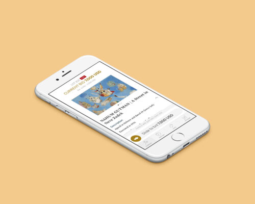
One important aspect of our products that needed some clean up were the bid states. An effort was made to simplify them make them consistent throughout the different platforms while using universal components. This helped reduced the clutter and reinforce our uniformity.

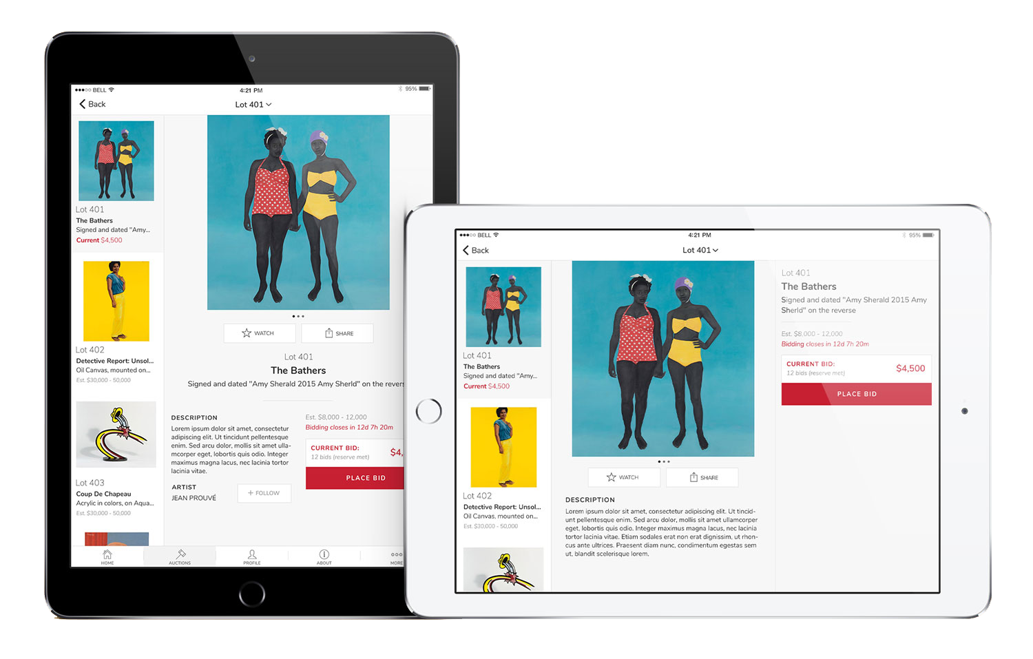
The new architecture made it possible to introduce targeted variations for key screens like auctions or lot review. These micro-customizations introduced the possibility to offer variations of our white-label product, giving each client a stronger sense of uniqueness without increasing system complexity.

Classic header style vs. full image for the lot review screen.

Minimalist approach vs. classic cards layout for the auctions screen.
We introduced some designs adapted to our tablet users (approx. 10%) and took advantage of the full real screen real estate, including dedicated layout work for the landscape views.
This project was my real introduction to systematic design. Rebuilding our foundation forced me to think beyond screens and flows and truly understand how large products scale. I learned the technical backbone of design systems — tokens, structure, naming, accessibility, documentation — and it completely reshaped the way I design. Today, I naturally think in patterns, constraints, maintainability, and long-term impact.
Working on this system sharpened my technical depth and taught me how design connects to architecture. I realized you can’t ship a major design system all at once — you have to structure it methodically, start small, and build momentum with clear milestones. That “little victories” approach now guides how I tackle any complex problem.
Design systems don’t sell themselves. A big part of the work was advocating for it — explaining the benefits, showing the long-term value, and aligning teams who all had different priorities. I learned to speak the language of money, efficiency, and risk reduction to earn stakeholder support. System work is cultural work as much as it is design work.
Above all, this project taught me that a design system is never “done.” After the advocacy and the build comes the ongoing care — monitoring how teams use it, guiding adoption, and refining it as the product evolves. Even though the rollout ended early due to the acquisition, the foundation we created proved how structure and stewardship can transform collaboration and quality.