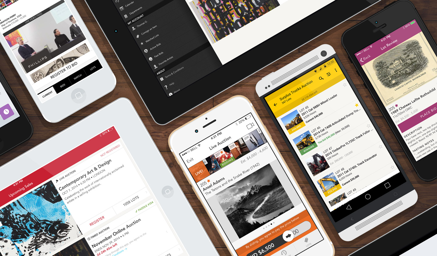
Context
Pain Points
- Fine art & visual inventories – Images appeared too small and the layout felt cluttered, making it difficult to showcase products.
- Live video feed – This crucial feature wasn’t prominent enough for users who relied on it.
- Current item visibility – The item up for bid lacked sufficient emphasis, reducing clarity and engagement.
The Opportunity
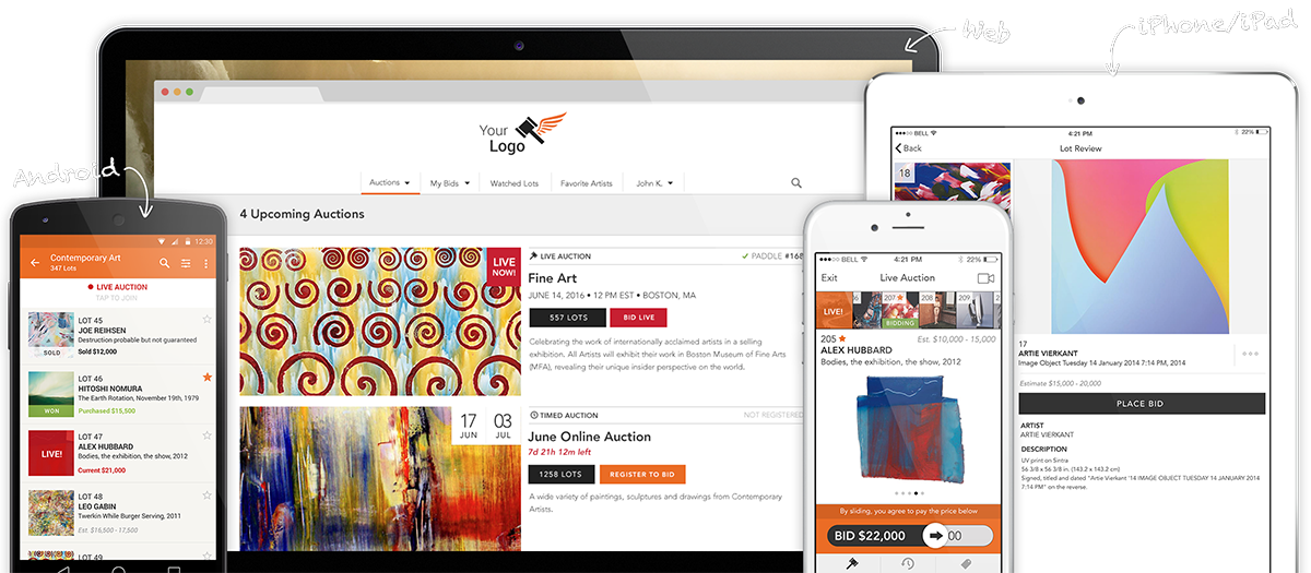
As Auction Mobility continued to grow, the demand for a more adaptable and user-friendly interface became increasingly clear. My role was to redesign the bidding room experience, addressing these challenges by implementing a more advanced design system, improved color hierarchy, and a layout that enhanced engagement and usability.

The bidding room design was starting to become outdated and was not not adaptable to all type of businesses.
As Auction Mobility scaled, the need for a more adaptable, user-friendly, and visually appealing interface became clear. A shift between the focus on the current item vs. the video feed was introduced.
LOT FOCUS VIEW

VIDEO FOCUS VIEW

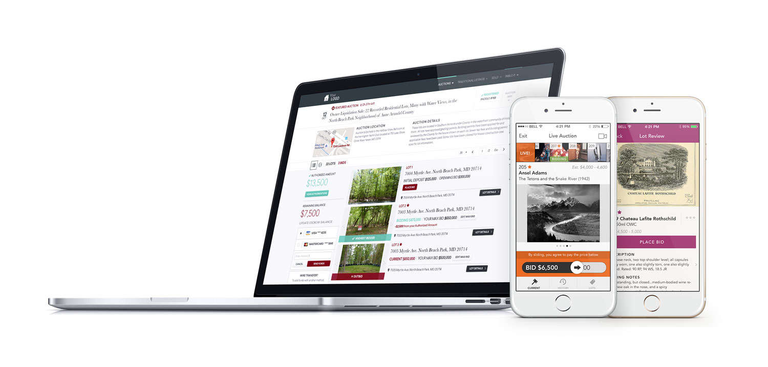
VERSATILITY
Discussions with a selected group of auction houses encouraged us to introduce small layout variations to accommodate all type of preferences. Those variations would be available at set up and inter-changeable for a maximum versatility. For instance, we offered the option to display the upcoming lots in a grid or list view, accommodating customers with few lots and beautiful imagery (like fine arts or wines) as opposed to customers with a large inventory and fast auction pace (like tools and machinery).

Variations were introduced, like the preferred layout for upcoming lots.
INTRODUCTION OF A PROGRESS BAR
A new innovation was to introduce a progress bar that indicated the remaining lots to come converted into a percentage. It offered a simple yet interesting visual clue of the auction development and gave the bidders better context. A small change that elevated the general user experience and engagement.

SMOOTH BIDDING FLOW
Bids can come in quick and it was not rare that someone places a bid and gets instantly outbid creating confusion. By introducing a simple color code (dissociated from the client’s branding), we created a clear visual clue for the bidder to tell if he is in leading position or not. Along with this change, we imposed a short delay (500ms) to the system when shifting between winning and losing states. This enabled enough time for the sequence or events to make sense for each bidder. A couple of small changes that definitely provided needed clarity and ultimately promoted a stronger sense of excitement during bidding battles.

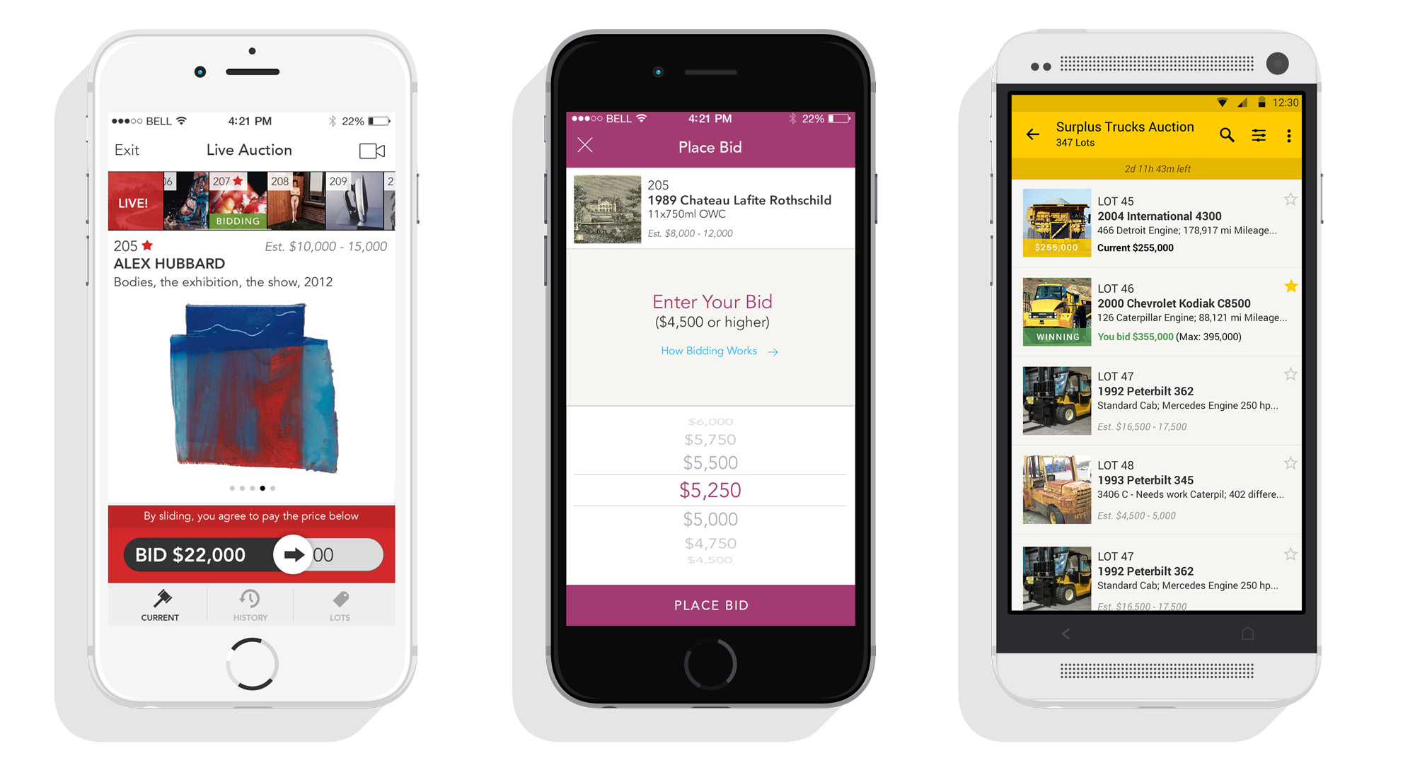

Some interviews with users revealed that it was not clear for all if they were the leading bidder or not as bids come in fast. A clear flow between the different bidding states associated with a simple color code created better understanding and increased participation.
Some of our older users (bidders and/or auctioneers) were not necessarily enthusiastic with the change. For that reason, we preserved the original design but simply translated it using our newly built design system components. This “classic” option was kept as part of the options customers could choose from during their initial setup.

The result
The redesigned bidding room interface led to a substantial improvement in user experience and engagement. The introduction of guidelines and reusable components with the Design System helped establish a cohesive experience for the users but also reduced the development time needed for all adjustments and updates.