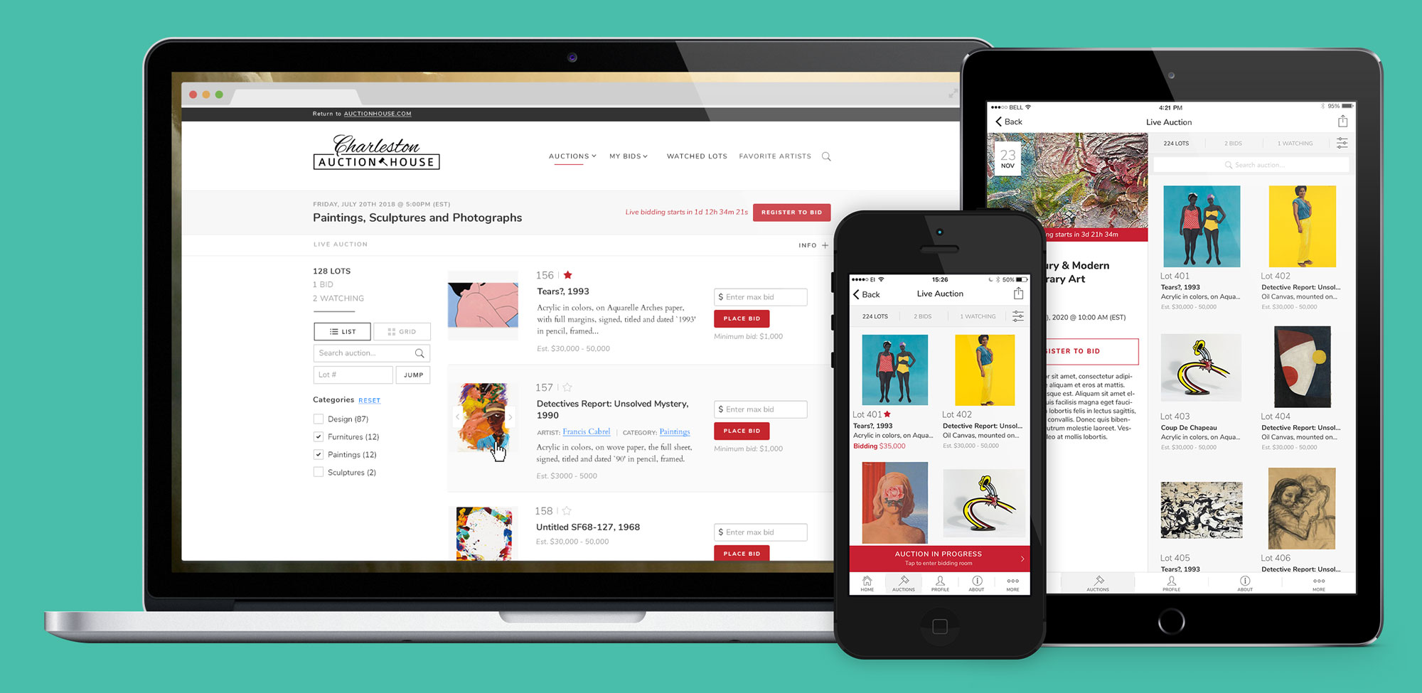
When Auction Mobility was created years ago, the idea was to have a cross-platform product that could satisfy all kinds of auction houses. After a few years of selling this product, the designs eventually got old and imperfections needed to be fixed. With the experience accumulated and all the feedback received, it was time to create the new generation of our products to not be left behind by competition. We needed a perfectly versatile and modular product that could work for a million dollar painting as well as for a rusty second-hand tractor. A customizable product that could be intuitive for the old and the young.
One modular product for all.
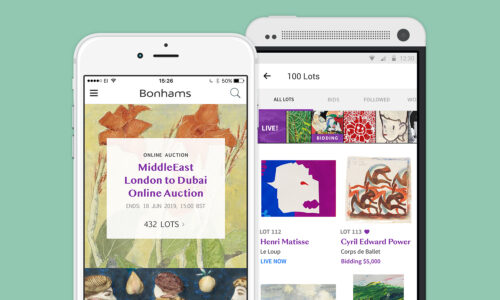
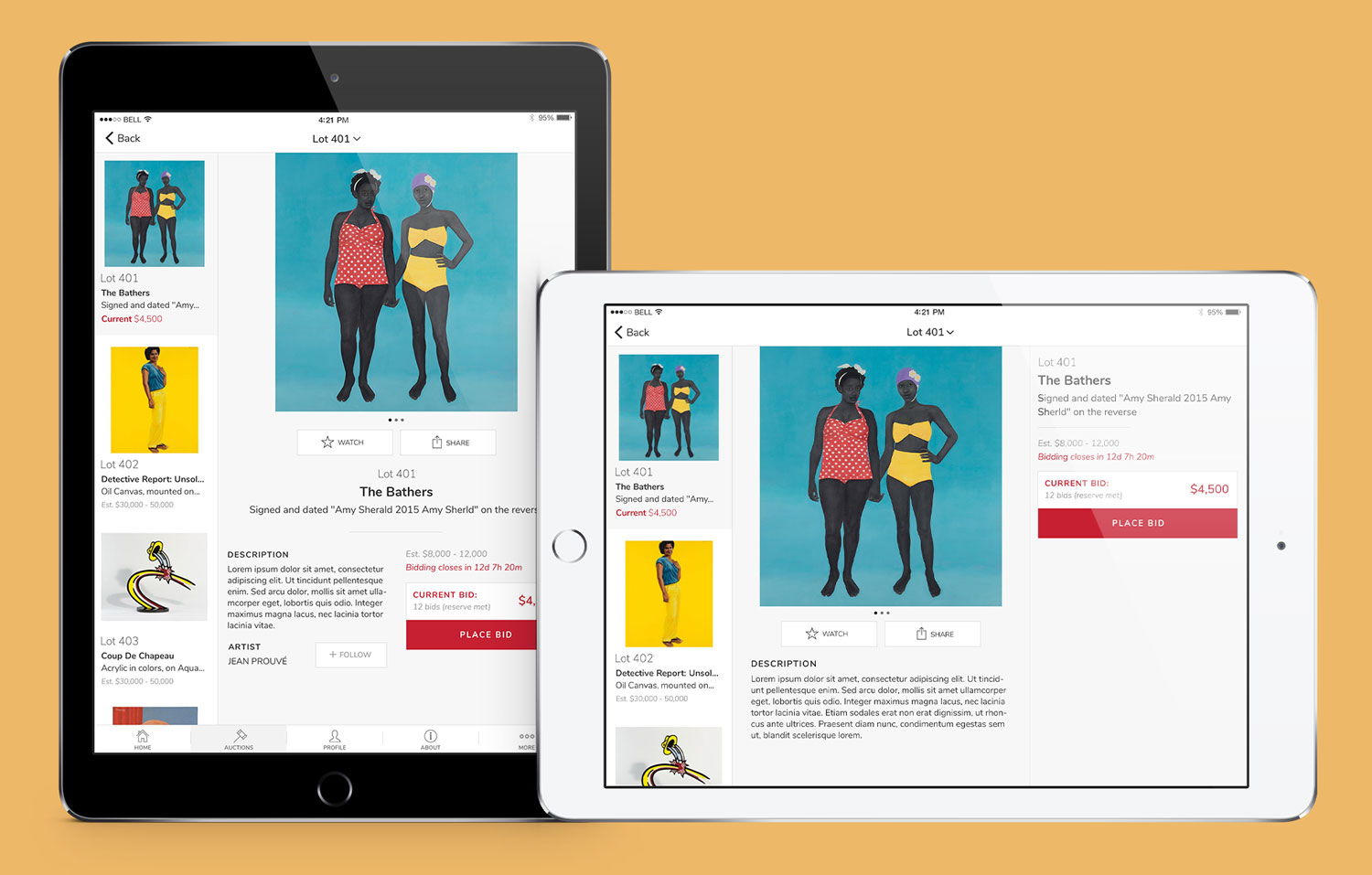
Taking advantage of all the space available on tablet.
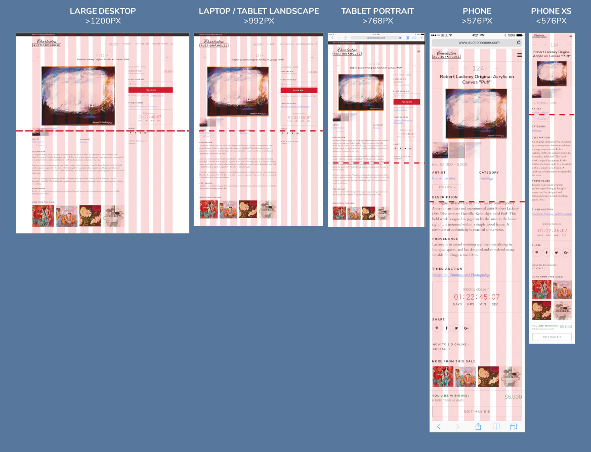
All designs were thought through with the largest and smallest devices always in mind, leaving no room for surprises on web, mobile and also responsive web.
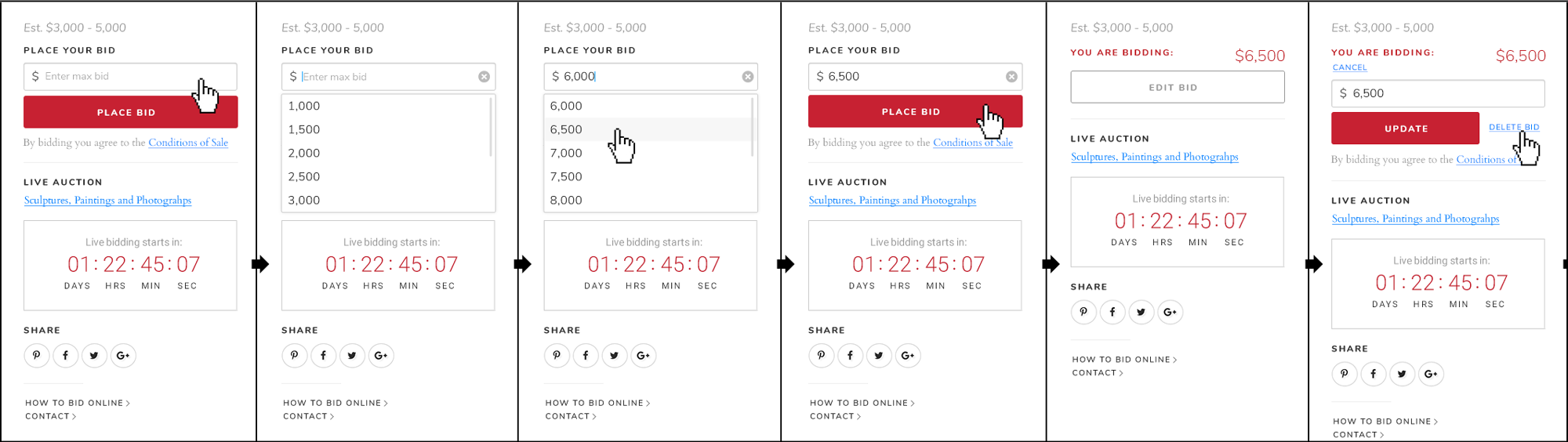
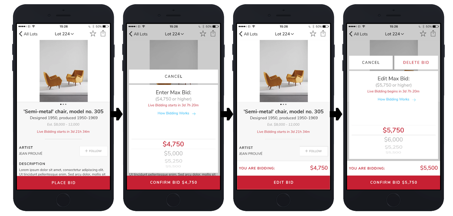
Placing a bid is the most important action and I made sure to create a clear design flow that was tested to be mistake-proof with a few selected users.